The World Meteorological Organisation (WMO) Global Framework for Climate Services (GFCS) was established at the World Climate Conference-3 (WCC-3) in Geneva, September 2009, with the joint aim of “better serving society’s need for accurate and timely information on climate” and increasing the number acronyms used in climate change discourse. The High-level Taskforce (HLT) was subsequently created to coordinate international efforts and develop the necessary guidance and infrastructure to support the development of climate services within National Meteorological and Hydrological Services (NMHSs…of course). Ever since, NMHSs and climate researchers have been clambering together in attempts to establish exactly what is meant by “climate services” and to determine how best to deliver these services to the public.
The WMO has prioritised the deployment of climate services in climate‐vulnerable developing countries…are there any developing countries which aren’t climate-vulnerable? In any case, it is interesting to monitor the progress of climate services provision, particularly in Africa where climate information is often fractured and poorly disseminated. I was therefore intrigued to learn about Ethiopia’s recent efforts to develop a set of freely available climate data maps, accessible from the Ethiopian National Meteorological Agency (NMA) website. The International Research Institute for Climate and Society (IRI) at Columbia University, New York, partnered with the Ethiopian NMA to integrate satellite based observations of rainfall and temperature with ground-based observations, compiling maps at a 10km horizontal spatial resolution. Funded by the US National Oceanic and Atmospheric Administration (NOAA) and Google, the project aims to improve the use of climate information in a number of societal applications. The IRI has suggested that the online maps, or what the WMO might refer to as a Climate Services Information System (CSIS), provides “a model for improving climate services in Africa”.
So to clarify the previous two paragraphs, as a result of the WMO GFCS and joint funding from NOAA and Google, the IRI and NMA got together to develop a CSIS. Is that clear? Good, let’s proceed.
Ethiopia certainly befits the description of a climate-vulnerable developing country. Extensive and extended periods of drought have severely impacted the lives and livelihoods of Ethiopian people, notably in the mid 1980s and more recently in 2011. The creation of an online climate data portal (more information available here) enables policymakers and communities to access information and acquire knowledge regarding the impacts of rainfall and temperature variability on national and local scales. For this, I applaud the efforts of the NMA and IRI. It is potentially a hugely beneficial resource to aid understanding of climate variability and climate change in Ethiopia. Yet the claim that this model is suitable for scaling up and introducing across Africa may be somewhat premature. It is essential to evaluate the usefulness of the resource for decision makers and communities before advocating similar efforts elsewhere. Furthermore, whilst it is important to provide data to enable people and businesses to better understand local climate, presenting data as information is misleading. Unfortunately, the NMA climate data maps are not climate information maps. Appropriate interpretation of the data requires more than a basic understanding of climate. The assumptions and limitations that ought to accompany the data are hidden and there is a real risk that the historical data will be interpreted as actual observations.
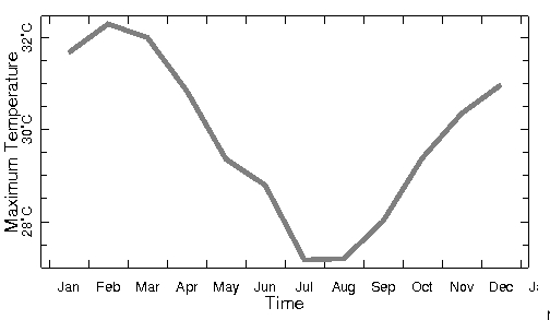
The climate data maps demonstrate that a “point-and-click” approach to climate services is misguided. Simply enabling users to extract data for a particular location of interest may lead to unfortunate consequences. As an illustration, I decided to arbitrarily pick two locations which were very close together in south-west Ethiopia. The locations and associated annual temperature cycles are shown in the attached figures (see below). Despite the two locations being very close together, at least visually on the map even if many kilometers away in reality (which illustrates the point), the difference in Tmax (which I presume is mean monthly Tmax, though this is not clearly stated) is around 4 degrees C throughout the year; in fact the max Tmax at location 1 is almost as low as the min Tmax at location 2. In establishing vulnerability thresholds and relating these to observed temperatures, any small discrepancy in the location would therefore lead to very different conclusions.
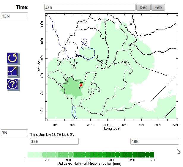
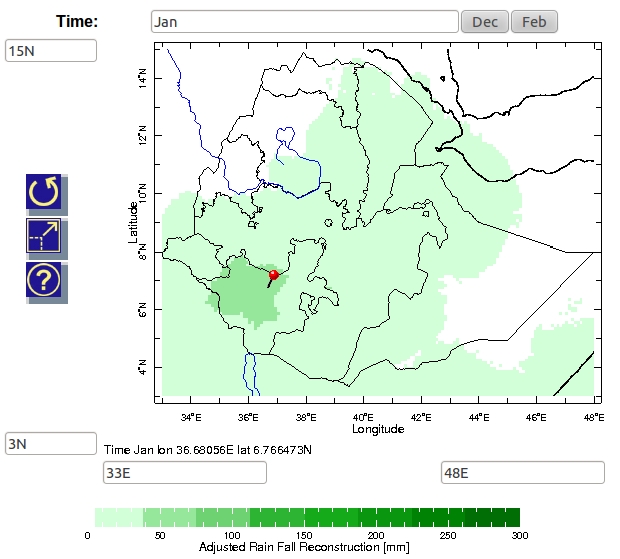
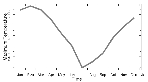
2
Providing accurate and timely climate information is a crucial component of building resilience to climate variability and climate change in Africa and worldwide. Enabling access to data whilst ensuring that data is not misinterpreted presents a key challenge for Climate Service providers. I’d certainly be interested to hear the thoughts of others regarding the extent to which the Ethiopian efforts represent a move in the right (or wrong) direction.
Helen Greatrex
TAMSAT is really based on our collaboration with African NMAs. We calibrate our products using historical rain-gauge data. As that’s highly sensitive in Africa and we don’t want to take data or expertise from Africa, we run workshops with NMAs so that they can calibrate the product themselves for their particular region. This means that there’s approximately 17000 gauges that goes into the TAMSAT calibration and also means that African NMAs ‘own’ the product for their country. For anyone who hasn’t come across TAMSAT, check out
http://www.met.reading.ac.uk/tamsat
I’m currently working with the Statistical Services Centre at the University of Reading – One of our main roles is to support African NMAs in providing their own analysis and information products rather than just selling raw data. A lot of the time, NMAs don’t due to data management, computing and expertise limits. Also, we find that often potential customers simply don’t know what to ask for. Therefore we try to work with potential customers of NMAs to help them know enough to ask the right sorts of questions.
I think it was a major achievement to get the Ethiopian product at all (for example in formatting raw observations/calibrating systems/data processing/web hosting etc). I know the project hasn’t ended yet, so hopefully now they can move onto aiding users with interpretation and analysis. I know they would love to get feedback too so you should pass your blog onto them!
Joseph
Hi Helen, thanks for your comment! Yes, I figured the difference in temperature would be attributable to topography but as you highlighted, that was my point: the data is presented without the extra (crucial) information about topography and land use (I am sure there is other relevant information which ought to be included too) and is therefore open to misinterpretation. It is also interesting to learn of your engagement with the NMA and IRI. Has the TAMSAT group been involved in calibrating satellite product with other African meteorological agencies? Thanks also for the link to SWALIM – interesting to see an approach which doesn’t centre on the provision of raw data. I had a brief scan of the website and I plan to have a closer look – I will encourage colleagues to do the same.
Helen Greatrex
Hi Joe,
Nice blog! The TAMSAT research group at the University of Reading were involved in helping create the 30 year timeseries of remotely sensed rainfall data – we were in Addis with the NMA and IRI in 2009 helping them calibrate their satellite product. However, we don’t advocate using satellite products at a ‘pixel scale’ or high resolution. Normally we look at the analysis averaged over a region or on a much coarser scale.
I’m not sure of the origin of the temperature data, but I suspect your discrepancy in temperature profiles is due to elevation changes – Ethiopia’s topography is highly variable. Your first point lies on the side of a mountain at ~2200m. Your second point is in a valley at ~800m, so a 4 degree temperature difference sounds reasonable. It would be interesting to see how this sort of analysis works in a less climatically/topgraphically complex country.
I think your point stands about climate information vs climate data though. For me to find out the information about your two locations, I had to look at Google maps and use my meteorological knowledge about temperature vs height – it wasn’t clear from the product itself. A really interesting approach is that taken by SWALIM, the Somali met service. They try to provide results and analysis before the user reaches the raw data itself (although this is still available). Check out http://www.faoswalim.org/
Considering the lack of freely available historical climate information over much of Africa, I think this is a step in the right direction, especially as it’s getting African NMAs to think in innovative ways about making climate information & data available. But I that there’s still plenty more steps to go before it’s a true climate information resource.
Cheers
Helen Greatrex