Twice as fast as the globe?
In one of the brief speeches at the Climate Strike event in front of SA parliament last Friday, a statement was broadcasted over the heads of the (unfortunately) moderately sized crowd that “South Africa is warming twice as fast as the globe”. That’s not the first time I’ve heard it – already for some time we at CSAG have been wondering about that “twice as fast” thing that is popping up every now and then in the media and government reports. Where does it come from? Is is true? Sounds high. It is not that I don’t understand that a bit of a hyperbole is not good for a scientific publication but is perfectly acceptable in an inspired address to chanting and banner-waving crowd in the street. But in the era of fake news, one should better check.
A bit of context
To know what data to look at and how to analyse them to evaluate the “twice as fast” statement, let’s try to unpack it first. Let’s look at the following phrasing: “South Africa is warming at a rate that is twice that of the global one”.
To start with, we need to understand why is such a statement made. Considering the context, I think it is made to make a distinction between South Africa and other countries/regions in the world. When we make that statement, what we are trying to say is that “South Africa is a much worse situation than many other countries in the world, because the people of South Africa are exposed to a much faster increase in temperatures than people of other countries.” That results from a simple and intuitive understanding that if South African temperatures increase at a rate of twice the rate experienced on average on the globe, there must be some countries or regions in the world, where that increase is much slower, say, half the global rate. Those countries are, by nature of that simple comparison, in a better situation than South Africa is. That interpretation makes sense irrespective whether the message is meant for international, or for local, South African, audience. What it brings home is the need to act in South Africa and to act now.
What is “global”?
The consequence of such interpretation are twofold: that we should consider political boundaries of RSA and that we should narrow down interpretation of “global”.
“Global” can be two things in this context: all land areas of the globe, or simply, the entire Earth, i.e. land and oceans. The difference is important because of the nature of energy balances near the surface of the earth there will be a difference in warming rate resulting from the greenhouse effect between land and ocean surfaces. Ocean has the capacity to absorb the energy from the sun and air, and move it away from the surface, and as a result, it can moderate increases of near surface air temperature. Land surface has a much lower capacity to absorb and remove energy from the surface that the ocean, and as a result, air over land warms more (faster) than air over ocean.
So, if we compare the warming rate over South Africa’s land with that of the entire globe, it is very likely indeed that it will be faster. But such a comparison will not tell us how does warming rate of South Africa compare to warming rates of other countries. It is absolutely possible that other countries or regions warm up at a rate identical to that of South Africa, or even faster than that. In this context, comparison of South Africa’s warming rate with the rate experienced by the entire globe (land and ocean) does not make sense, because it does not single us out in any way. If the statement is to maintain its power, “global” in it has to pertain to the global land areas rather than the entire globe, i.e. land and ocean.
Other considerations
There are a couple of other aspects that we need to clarify before we get on with data:
- the “warming” part of that statement is about air temperature, typically expressed in climate and weather science as air temperature at 2 m above ground.
- the rate of warming is simply an expression of how fast the air is warming, and not how hot it gets. That rate or speed can simply be expressed in terms of the increase in temperature in degrees Centigrade recorded during a certain period of time. It does not matter whether the temperature “after” warming is 30 degC or 10 degC. What matters is by how much has the air warmed.
- finally, let’s note that there is no indication of time in the “twice the global rate”, i.e. no indication of warming over what period should be considered. The statement is in the present tense, which implies now (as in this very moment), or in general (as in now and some indiscriminate period of time before now). Obviously, it cannot be the last couple of days, or weeks or even months. If we looked at those, we would see either changes in weather, or at best changes in seasons, i.e. transition between winter and summer. To assess changes in temperature in the context of global warming, one needs to look at years, or better multi-year periods, decades perhaps? This is not so easy to decide, and this is, in a way, the focus of the analyses below.
The data
We have limited choices here. We obviously need a time series of air temperature for a considerable number of locations over the entire land area of the globe, including South Africa. One can work with global meteorological station datasets, for example, GHCN or GSOD, but that would involve a rather tedious process of patching and harmonizing data from various sources and accounting for different station densities etc. Others have done that for us, and there are a number of datasets available that provide gridded, continuous coverage of temperature data over land. These datasets were generated from individual meteorological stations data, through screening, cleaning, patching and spatial interpolation, and since various methods and approaches could be involved in each of those steps, the outcomes are different. And the conundrum is that we cannot really say which is the best. So normally, in a situation such as the one here, one uses several different datasets, and distills messages that are robust across them.
I will use two gridded land temperature datasets: one created at Climate Research Unit known as CRU, and one created by Berkeley Earth known as Berkeley Earth Surface Temperatures or BEST (mind this is the acronym of the dataset, not a statement of it’s quality;-). The data for those can be obtained from the respective institutions, or simpler through KNMI Climate Explorer.
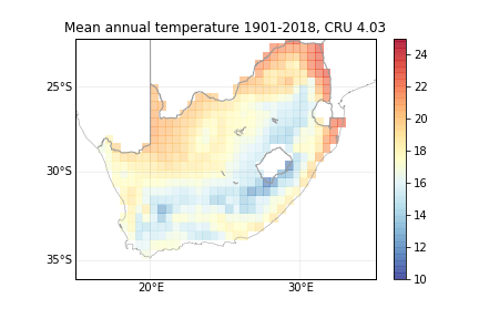
Let’s focus on CRU at the moment. That dataset has a resolution of 0.5 deg, i.e. approximately 50km, has a uniform coverage over global land areas and its 4.03 version covers the period of Jan 1901 to Dec 2018.
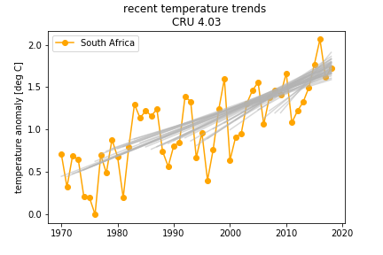
This is the mean annual air temperature calculated over the entire available period for RSA. That mean annual temperature ranges between ~10 degC in the Drakensberg Mountains to ~24 degC in the northern Limpopo. On average, air temperature over the entire RSA is about 17 degC.
Temperature “creep”
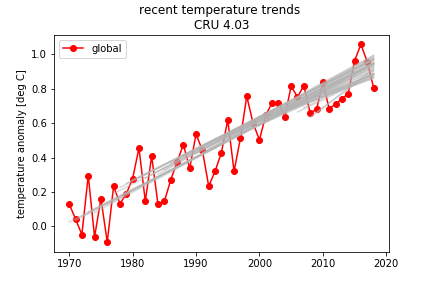
This is a time series of mean annual air temperature averaged over the RSA, and that averaged over all land areas in the world:
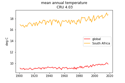
Clearly, South Africa is considerably warmer than the global (land) mean. But we are not looking here at the mean temperature, but at how fast the temperature is changing. To illustrate the change of temperature better, I calculated temperature anomaly, and used the 1901-1930 period as a reference. The reason for choosing this period is that it spans the first 30 years of the dataset and thus allows to characterize the state of climate as far in the past as it is possible given the data at hand. Anomalies calculated with respect to that period are the closest we can get to with this dataset to what we would call “anthropogenic” warming, i.e. warming since the pre-industrial times.
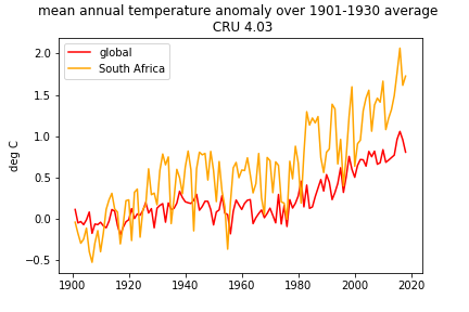
We see that the 2016 was the warmest year recorded so far, and that the last year shown there, 2018, was a bit cooler than 2016, both in South Africa and globally (apparently, 2019 has beaten the 2016 record, but I don’t have data on that yet). Do the lower temperatures in 2018 than in 2016 mean that the Earth is cooling and not warming anymore? Not at all. This is just a result of climate variability – there are many similar short periods when the temperature drops for a year, two or three in a row (or even longer, for a decade or two – but more about this later), but the overall picture is clear – air temperatures are rising both in South Africa and globally.
As an aside, the extremely high global and South African temperature in 2016 is a result of combination of anthropogenic climate change and the El Nino phenomenon – the 2015-2016 El Nino was one of the strongest on record.
The picture of the slow “creep” of air temperature is event clearer if temperature is averaged over 5-year blocs rather than over a year:
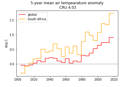
There are still 5-year periods that are slightly cooler than the previous ones, but overall, we see the persistent climb of temperatures, with the period of 2013-2018 period unprecedentedly warm.
From the two figures above, if we look at the “end point”, i.e. the current temperature anomaly, it seems that indeed South Africa warms faster than the globe. Recent air temperatures are in the order of 1.5-2 degC warmer than the 1901-1930 average in South Africa, and about 0.5-1 degC warmer that the 1901-1930 average globally. Does that imply the “twice the global rate”? Not really.
If we want to be precise – the hottest year (2016) temperature anomaly was 2.06 deg C in South Africa, and 1.05 deg C globally. That gives a ratio of warming rates of 1.96. If we take the most recent 5 years, the anomalies are 1.73 deg C and 0.91 deg C respectively, giving a ratio of 1.90. Which is about 2, but is it? Notice that I can tweak the calculations of this type by picking the starting and ending year, and I can get some range of results. But that starts to smell of “cherry-picking”, i.e. selecting the most favourable conditions to justify the hypothesis, which I obviously refrain from. In the above I effectively compare a 30-year mean from the beginning of the last century with a 1 or 5-year mean from the most recent period. If I chose not so recent year or 5-years I might have different results.
So the “end point” analysis, i.e. when we are concerned with the overall warming since the beginning of the last century, shows that the “twice the global rate” statement is not that bad a point to start with. But there is more to that analysis.
Changing rates of temperature increase
Is the warming rate changing in time? Has it been stronger recently than throughout the 20th century?.
We can calculate rate of change for 5-year on 5-year changes, for both South Africa and the globe:
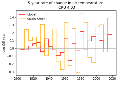
But that’s not very informative. That rate varies rather wildly. There are some periods when it is negative, i.e. there is that short-term “cooling”, and there are periods when it is rather high. But there appears to be a weak systematic pattern there, i.e. there seems to be some increase of the rate in the recent times.
The recent 5-year warming rate (i.e. rate calculated as a difference between the means of two 5-year periods of 2014-2018 and 2009-2013) was approx. 0.39 degC/5 years in South Africa, but only about 0.18 deg/5 years globally (those are the last two “bars” in the figure above). More than “twice the global rate” actually. But importantly, the comparison of temperature change rates in the preceding period (2009-2013 vs. 2004-2008) reveals something totally different – there was actually some cooling both globally and in South Africa. So, again, one might ask – are we warming? or are we cooling? And again, the differences and variability we see at this time scale reflect mostly the interannual variability rather than some systematic effect that we would associate with anthropogenic climate change. Calculations of warming rates at those time scales are not very robust, not very defensible…
So perhaps we need to look at longer time scales?
Longer time scale
Before we get there, we need to make another observation – what the figures above show is that there is a longer-term pattern to warming, both global and South African, with some increase in temperatures in the beginning of the 20th century, then a period of cooling and then a relatively strong and constant warming in the recent (approximately post-1980) period. This is slightly better exposed in a figure below, in which I smooth the year to year variability using a lowess smooth.
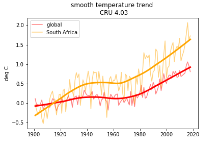
South Africa WAS warming faster than the globe in the beginning of the 20th century, and the recent, i.e. roughly post-1970s phase of warming is too clearly faster (I’m looking at the slope of the smooth line) in South Africa than it is globally
The above figure requires another aside, for one may ask that if there is anthropogenic warming since the pre-industrial times, then why do we actually see cooling in the 1940-1970 period? Climate scientists explained that – the cooling is a combination of a balance of warming effects of carbon dioxide emissions, cooling effect of aerosol emissions (all in the complex world of the 1930-1970 period, that included the 1930s economic depression, 2nd world war, post-war economic boom and introduction of pollution controls in the 1960-1970s) and a reduction of solar radiation.
Let’s try to plot trends in the three periods:
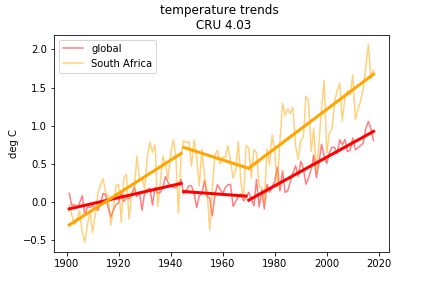
We can see that South Africa was warming faster than the globe prior to the 1940s, was then cooling faster than the globe in the 1950s, 60s and 70s, and since then it warming at a rate that is indeed faster than the global. To be precise: the 1970-2018 warming trend in South Africa was 0.026 degC/year, while globally it was 0.019 degC/year, with the ratio of 1.36. So in that period, South African warming rate was not twice the global, it was more like a third of the global.
Are the warming rates changing in the post-1970 period?
Ok, but the above assumes that the rate of warming is uniform over the entire 1970-2018 period, both globally and in South Africa. Can we perhaps check that assumption? We’ve looked at the individual 5-year periods earlier, and it seemed that there was quite a lot of “noise” in these short-term warming rates. Let’s try a different approach.
Below, I show a time series of temperature anomalies, and calculate temperature trends (using a non-parametric Theil-Sen slope) for each period starting in a year between 1970 and 2009 and ending in 2018. These are the grey lines in the figures. Note that I don’t plot shorter-term trends (i.e. trends in the period of 2010-2018) because these will be strongly affected by interannual variability.
And now, I plot the slopes of all these individual trends:
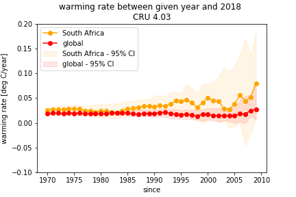
The figure above includes, apart from the value of the slope of each of the trends, also the estimate of its uncertainty – that is the 95% confidence interval (which I calculate using bootstrapping). That interval simply shows that there is some uncertainty about the exact value of trend that is related to the number of data points from which the trend was calculated and their variability. The uncertainty becomes an important part of the story. Why? Because we know that there might be errors in our data. And what we are after is really the “real” effects, and not effects that might be caused by data errors. Calculating confidence interval allows to do that. The interpretation of the confidence interval is simply so: “there is a 95% probability that given data at hand, the effect that we are evaluating falls within that interval”. In our case it reads for example like this: “although the literal warming rate calculated from the temperature data for South Africa for the period between 2010 and 2018 is 0.1 degC/year, there is a 95% chance that the actual warming rate in that period was between 0.02 and 0.12 degC/year”. That makes interpretation of results difficult, because one has to move from the language of certainty to language of probability… But the language of probability is right in this case, unfortunately, so let’s stick to it.
The warming rate (expressed by the slope of the trend) changes between the various periods, but seems to be increasing both in South Africa and globally the closer we get to today. The warming rate peaks in 2009 both in South Africa and globally.
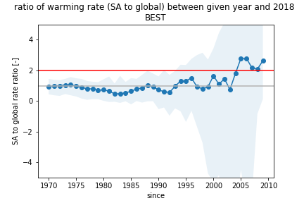
Finally, I can calculate the ratio of South African and global warming rates, for various “recent periods”, i.e. based on each of the trends (and accounting for uncertainty through again, calculating confidence interval):
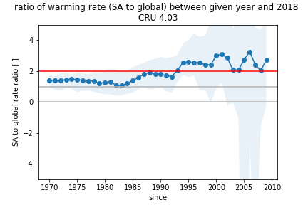
Red horizontal line in this figure marks the “twice the global” rate, grey line – the same rate as the global. What this figure shows is that temperature increase rate is faster in SA than globally. An it seems indeed that in recent years South African warming rate has reached and even exceeded the level of about twice the global rate. There is still some influence of the choice of the period – i.e. the ratio varies from point to point, but at least we can see some overall pattern. And that pattern is that of increasingly faster warming rate in South African than globally.
However, since there is data-related uncertainty in our estimates of trends and their ratio, we cannot say that the “twice the global rate” is definitive and certain. The final figure I show here illustrates the probability that such a statement (strictly speaking the statement that the “SA temperature increase rate is twice or more that of global”) is true, given the data that we have. That probability is calculated in a similar way to how the confidence interval is calculated:
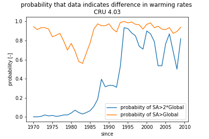
It looks like at best we have only about 60-80% probability that the “twice as fast” statement is indeed true. We have, however, about 90% probability that South African warming rate is faster than the global one…
Berkeley Earth temperature data
And finally-finally, we can have a look at how does the South Africa-global warming rate comparison looks if we use the other temperature dataset – Berkeley Earth’s BEST. I will skip the mundane, and show only the last two figures:
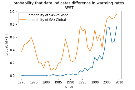
These show, that according to the BEST dataset, it is only after approx. 2004 that the warming rate became faster in South Africa than globally, and that earlier South Africa was clearly warming at a rate similar to that of the globe. The message coming from this dataset about the “warming differential” is different than that coming from the CRU dataset. Which further dilutes
To sum up
I did not get a definitive answer – uncertainty obfuscates the final results. But even in spite of that, it seems that the “twice the global rate” or “twice as fast” is close to reality, and considering the context it is used in – it is a reasonable expression of South Africa’s conditions particularly in the last 20-25 years.
However…
There is always a “but”. What I show above is analysis of “effective” warming, and that is not necessarily attributable to anthropogenic climate change. There is natural climate variability that takes place at various time scales – from interannual to multidecadal. The analyses that I’ve done above filtered out the shorter time scales – between a year and a decade. But the longer time scales are not dealt with, and are only partially implicit in the uncertainty estimates. It appears that the most robust estimate of the anthropogenic warming component is that emerging from the analyses of long-term post-1970 trend, and that gives us value of the warming rate ratio of 1.36, and perhaps lower if we were to consider results from BEST data.
Overall, South Africa seems to be taking a larger brunt of the climate change than an average country, at least in terms of temperature. And if the trend in the relationship between South Africa’s and global warming rate continues (i.e. if the South Africa’s warming rate continues to be faster and faster than the global one) its future looks bleak indeed…
We need to do something about that warming, don’t we?
Please note that after publishing the original version of this blog I have identified an error in data processing. After fixing that error, some of the conclusions emerging from the analyses have changed. Current version of the blog is redacted to include the up-to-date correct results and conclusions. Thanks to Chris Jack for pointing out that original deficiency.
Featured photo scavenged from: http://www.cadenagramonte.cu