Here you go…
COVID-19 Data Monitoring Page
There is loads and loads information on Corona epdemic out there. There is also loads and loads of noise.
What is here, is basically for my personal use. I try to look how the epidemic evolves in various countries for various reasons. And I did not find anywhere a presentation of the COVID-19 data in the way that would satisfy my curiosity. So I had to make it myself.
Firstly, and foremestly, it’s not a race, it’s really not about which country has more cases, and where do these cases grow the fastest. Or the slowest.
This visualization is about seeing the pace of the development of the pandemic, and by comparing that pace to actions taken by individual countries, trying to understand what works, what does not work, and if it works, then how much time does it take for it to start working. And trying to understand how long are we all in for this.
So what’s so different about this visualization?
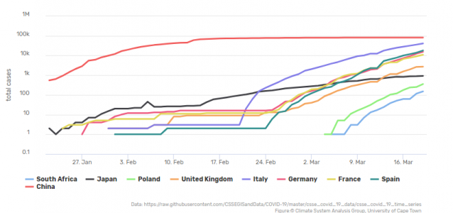
Number of cases is plotted here by default on logarithmic scale. This means that the numbers of the vertical axis are not evenly distributed. On a “normal” or linear axis, the distance between 1 and 10 is the same as the distance between 11 and 20. On a logarithmic axis, firstly, there is no 0. Secondly, distance between 1 and 10 is the same as the distance between 10 and 100, and the same as the distance between 100 and 1000.
What the logarithmic scale does is that a variable that is subject to “exponential increaese” plots as a straight line. And the exponential increase is what describes well the pace of increase of covid-19 infections. OK, not all the time, but at certain phases of the spread it does. And the phase when it does so is very scary, because we see progressively more and more infections.
The exponential increase is happening when the disease spreads uncontrollably. When we start getting some control over it, the number of cases can still be increasing, but not as fast as it was during the unconstrained phase. Thus, a deviation from the exponential increase is very informative. And it is very difficult to see that deviation ocurring in a “normal” linear plot, where the lines are very “spiky” and change slope all the time. But it is very easy to see a deviation from the exponential increase in the logarithmic plot. It is because in the logarithmic scale what we term “exponential increase” plots as a straight line, and our senses allow us to easily tell a straight line from a curving line.
Moreover, there is one more thing that is easily possible when the number of cases is plotted in the logarithmic scale – one can easily compare “trajectories” or rate of increase in infections of various countries. It is not possible in a linear scale plot, because infections in various coutries start at various times, the spiky, curvy lines do not align and differences/similarities are very difficult to asses visually. In the logarithmic scale, we see similarity/dissimilarity in the rate of increase between various countires by comparing slopes of the straight sections of their respective lines. Again, it’s not a race and it’s not about who is the fastest (or the slowest). But this makes one start thinking of reasons behind differences… Try to see the difference between countries such as Singapore or Japan and Spain or UK, and you will see my point.
Have insightful exploring…
Source of data
All data are from here
NB. The data will update automatically every morning.
Feedback?
wolski (at) csag.uct.ac.za